Facilities
![]()
In an industry heavily tied to desktop computers, going mobile has been a difficult problem to tackle. Research into our users suggested a want for mobile technology, but companies weren’t keen on buying devices for employees or allowing them to use personal devices. Nonetheless, as we’ve moved more mobile in the real world, the trend has followed in the industry, and after several years of persistent pressure I was given the okay to design an app for maintenance professionals on our platform. With a focus on quickly accessing information with or without connectivity, simple task-based workflows, and improving customer relationships via realtime access to our platform, the facilities app emerged and was recently released on Android, with an iOs version coming soon.
Experience with Product: 1 year 4 months
The Process
Product Research Review & Analysis
With a well-reviewed desktop and mobile site in production, we already had a set of base requirements. I did a little bit of user-focused research to a specific area that we would be focusing on but mostly focused on deciding how to cut down the desktop platform into a simple mobile app.
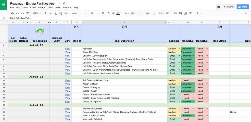
Roadmapping 6, 12, 18, and 24 Month Planning
Our five-person strategy team reviewed my project plan and worked on setting up sprints and figuring out where we would pull resources from. Since this app wouldn't be a revenue driver it had limited resources and that would be a determining factor on our timeline.
Wireframing Low Fidelity Design
Using Adobe Xd I worked out a number of simplified, user-friendly workflows for the base portion of the app. This was taken directly from our original web-based mobile solution but simplified to focus on task-based usage.
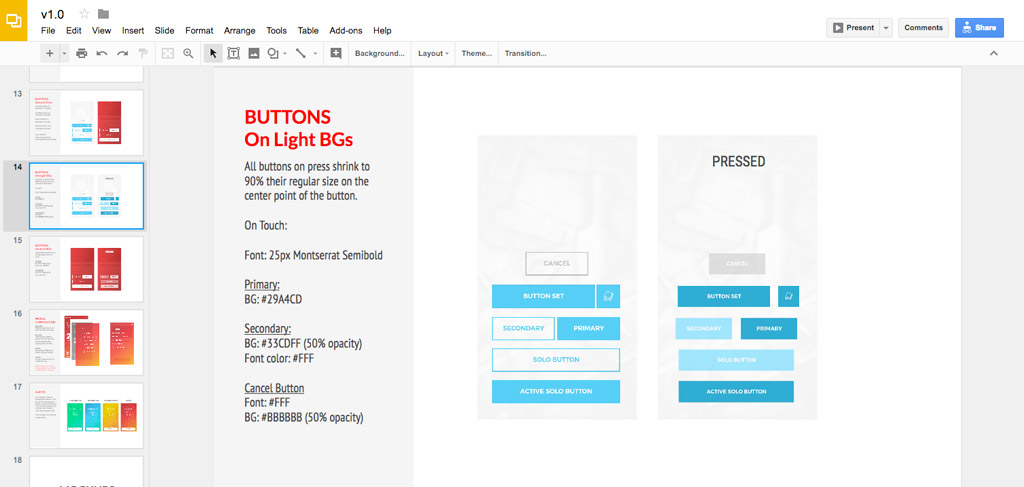
Style Guide Design
Being the third app in the Entrata product suite I had worked out most of the branding and style requirements for our platform in the previous apps. Since the UI differed slightly for the user, there was a little bit of update for buttons, font-sizes, and layouts.
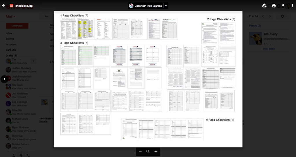
Mockups High Fidellity Design
The initial design phase was only 2 months, with most mockups for version 1.0 being completed before a dev team was able to start work. Over the course of the following year, several phases of design for versions 1.1, 1.2, 1.3, and 1.4 were completed while the app was in development.
Prototyping "Touch Prototypes"
After the initial design phase, I took the product into Adobe Xd and built touch prototypes that would be used for user testing both remotely and in person. The prototypes would also help our dev teams work through the work flows in real life.
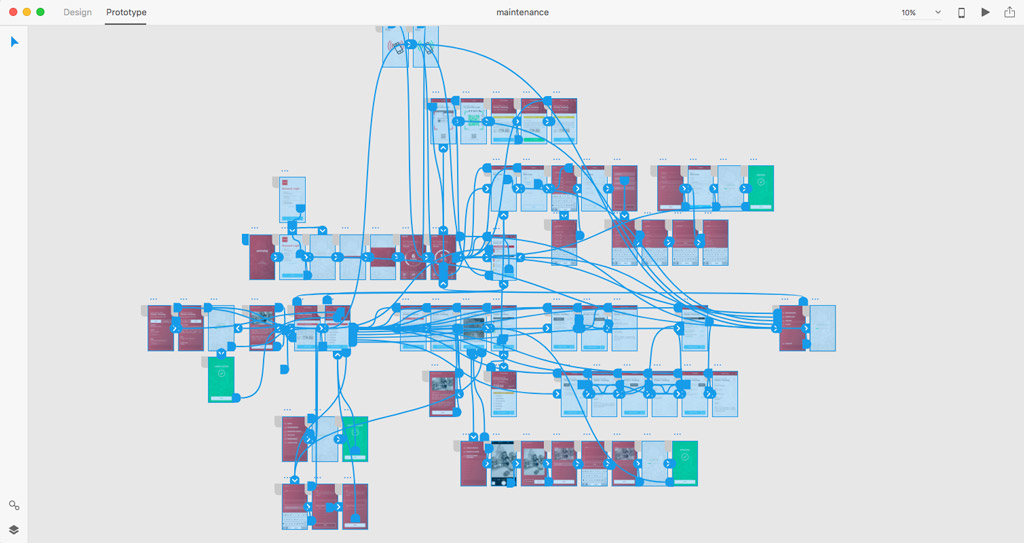
User Testing Research
Several rounds of in-person and remote user testing covered the basic functionality that would be released in version 1.0. The testing provided insight into how our users would take to new workflows that simplified their processes and focused on eliminating unhelpful interface.
Production Mockups Design
The final step was a review of all the screens making sure everything was pixel perfect and ready for development to take over. With executive sign off the app was off to development while we worked on the motion to be added after version 1.0.
Motion Design
Due to resource conflicts, this was the first project I handled our motion design for. Becuase of this I waited till after finishing production mockups, knowing the motion design wouldn't be implemented until version 2.0 at some point in 2018.
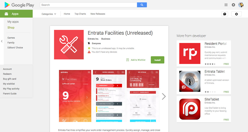
Product Release 14 Months later
From the project kickoff in the summer of 2016, version 1.0 was released as a beta on the Play Store in September 2017. It included the ability to complete service requests and manage workload during the day.
The Product
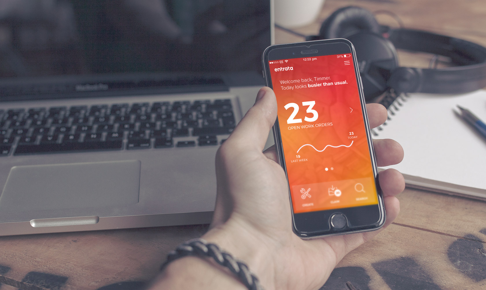
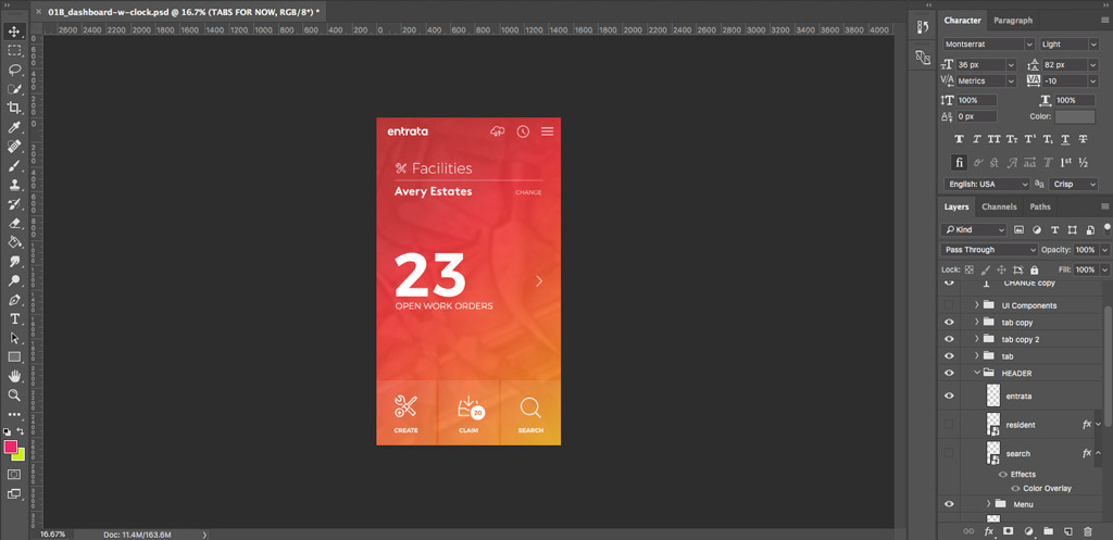
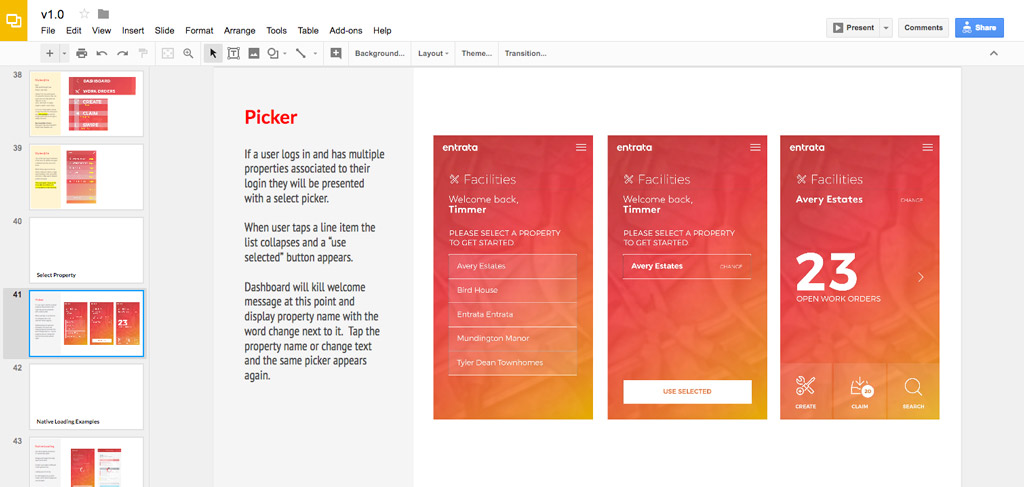
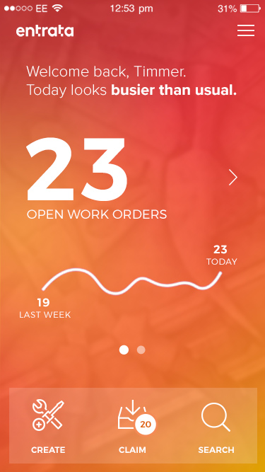
Simple Dashboard
Customer focus groups, questionnaires, and on site visits with users provided insight on what maintenance professionals wanted from this app. The number one thing users cared about was how much work there was to do every day when they got to work. I tackled this problem with a simple solution: a dashboard with a large number for an overview. Follow up user testing provided 95% positive feedback, with users happy that they could quickly gauge what type of day it was going to be with a simple stata point.
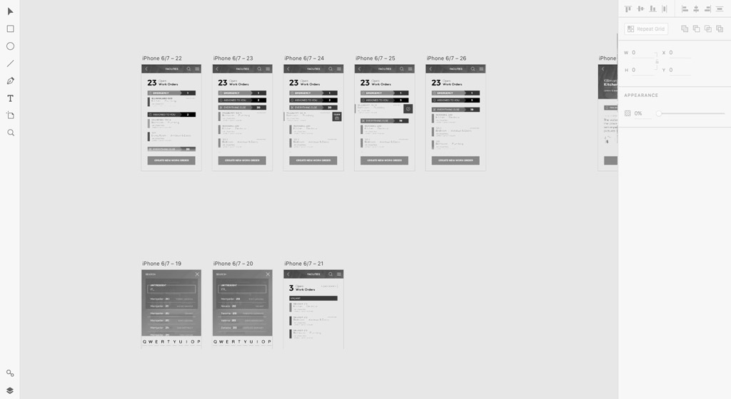
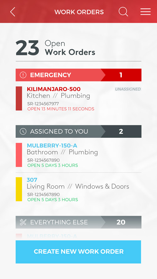
Data-driven Lists
One problem we have had issues with in the past is sorting maintenance problems for our users. In a desktop setting it was easy to provide multiple sort solutions based on different properties wants and needs. ON mobile with condensed information visible, and the focus on getting work done, we didn’t want to burden the user with settings, filters, and sorts that weren’t necessary. Looking at analytics, I was able to determine we could split lists into categories with no direct correlation. All users would see emergency work, followed up by assigned work, and finally a list of all other work sorted by priority. Data points we had collected helped make this decision that could be backed by past use.
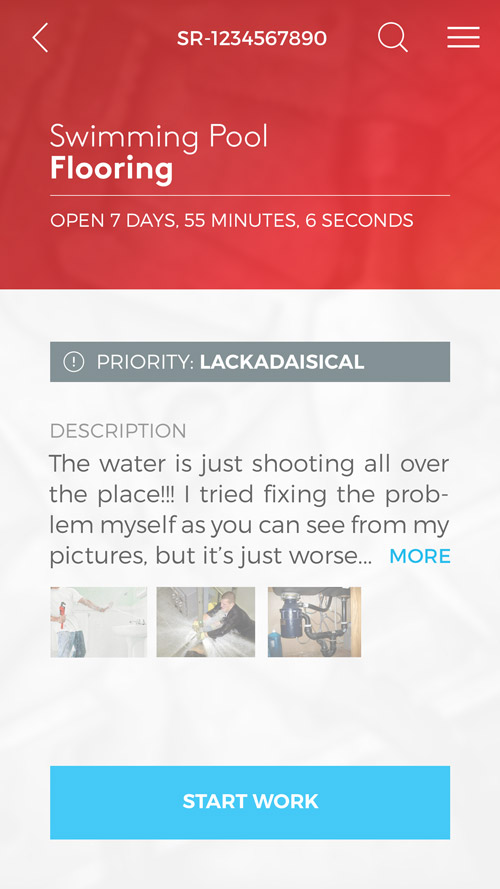
Add a Click, Save Time
Using data to drive many decisions for the app, we made another one, to add in an overview screen in between lists and actual informational pages. These overviews contained a limited amount of the most accessed information that a user could look at to make a decision, without having to pull in a more information they didn’t need. In user testing scenarios this played out to universally positive feedback as we learned that in many cases the only reason a user would access their final destination was to complete an action when in the field. Most of the time they just wanted details so they could make a decision from their phone.
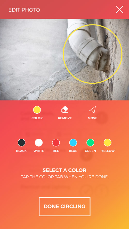
Smart Annotations
One decision I made for the app had nothing to do with analytics and data--but with watching the actual frustrations of maintenance professionals. One example was with pictures. Users would photograph something then have to add descriptive notes to explain what was in the photograph for whoever was going to look at it. What if the user could just write on the photo, make an arrow, or circle something? Putting together a short presentation I showed users the possibilities and received 100% positive feedback on the functionality.
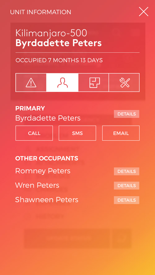
Information Digestion
Once I got into the nitty gritty of user testing, I found one area where it was apparent I needed to give access to more information than our initial research suggested. The problem was how to fit multiple pages worth of information gracefully into one screen. After playing with some ideas I ended up simplifying an information overlay with icon-based tabs and swipe functionality to fit excess information on the screen. In early testing users liked the ability to access the information, and figured out the interface after a couple runs through testing. Sometimes a simple solution ends with a more complex UI than you hoped, but when it benefits the user it’s a win.
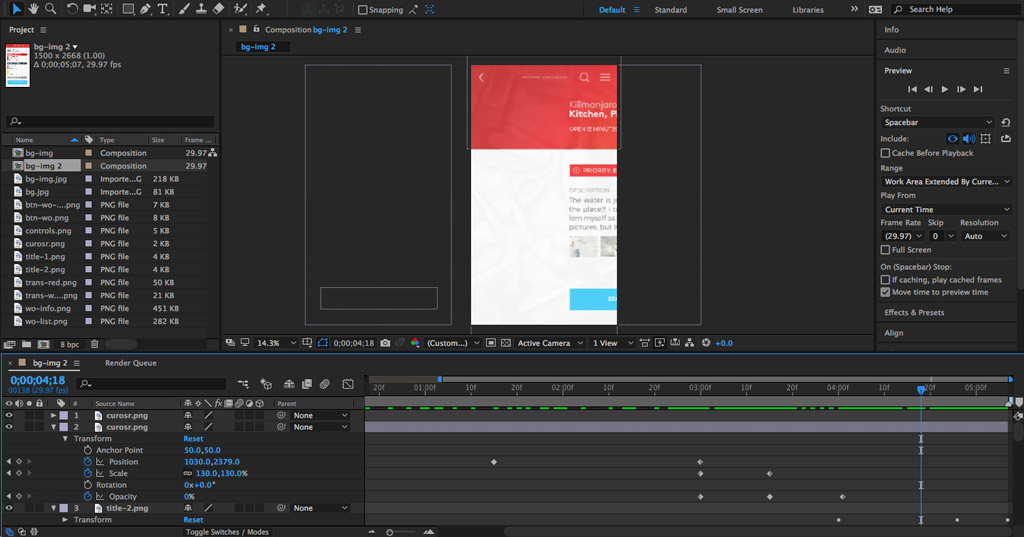
Motion Design
I'm currently working through the motion design for this app, and can talk more about it at a later time. For now, here is an example of how the initial dashboard load will happen.