ResidentPortal
![]()
For several years I pushed the idea of a mobile app for resident to help ease the task of paying rent online. Payment apps were nothing innovative--but in the multi-family housing space they were virtually unheard of. It wouldn’t be my pushing that drove the app finally coming to fruition, but a business decision that provided a development team we needed. I led a design team working with development and business. From wireframing, to compiling mood and motion boards, through mockups, and motion, the desing process was done in 2 months--and the app was to market in jsut 6. Within a year and a half the app had more than 200,000 monthly users and is one of the most highly rated apps in the industry.
Experience with Product: 2 years 5 months
The Process
Roadmapping 3, 6, 9, and 12 Month Planning
Our five-person strategy team reviewed our current desktop/mobile offering and look at industry competition, as well as products outside the industry that we found useful or enlightening. Developed project scope, timelines, high-level requirements, and set responsibilities.
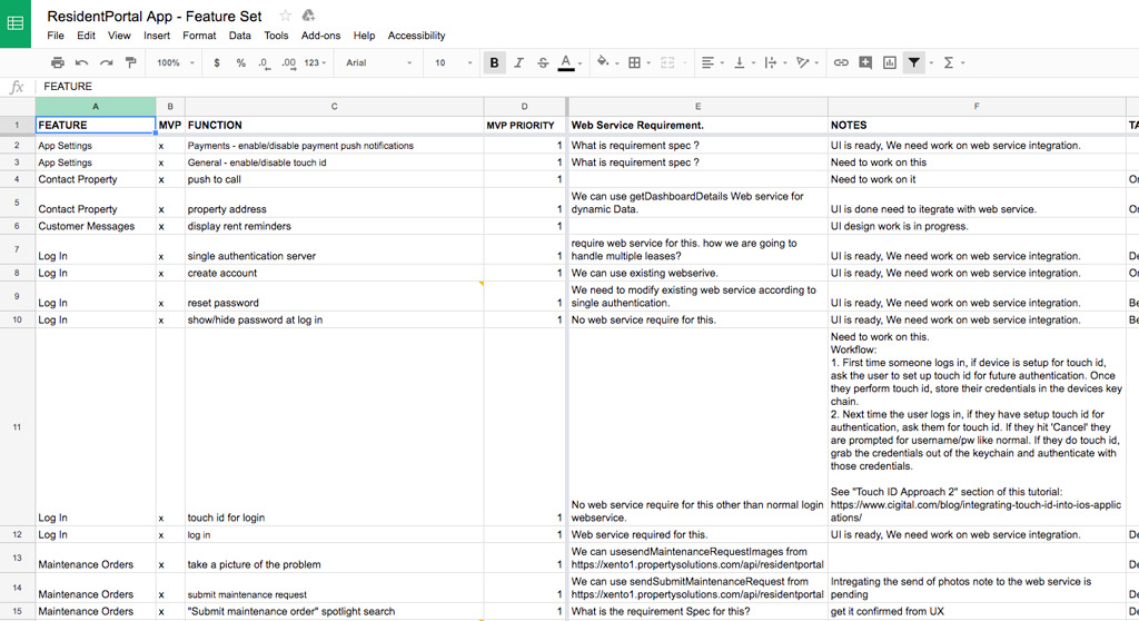
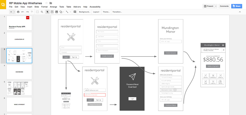
Wireframing Low Fidelity Design
My team handled breaking down the requirements and creating a detailed user workflow and wireframes to cover the scope of the project.
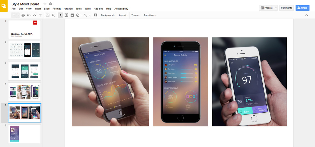
Mood Boards User Reasearch
Before starting the design and branding phase we researched the current app market and looked at what worked and didn't. Mood boards provided inspiration for the team to dive into the design.
Branding Design
During the design phase, we went through 3-4 iterations before ending up with the final style set, icons, fonts, and overall feel of the app. One major consideration we had to play out was white labeling for our customers to be able to brand the apps to fit their company needs, while still meeting our user requirements.
Mockups High Fidellity Design
Over the course of 4 weeks, I mocked up nearly 300 screens to present to users and stakeholders for review. In the following 4-6 weeks, another 100+ screens were added to tie into later versions of the app.
User Feedback and Testing Slideshows & "Touch Prototypes"
Touch mockups were created to run some user tests on mobile devices and remotely through GoToMeeting. Presentations were made to stakeholders and the strategy team as well.
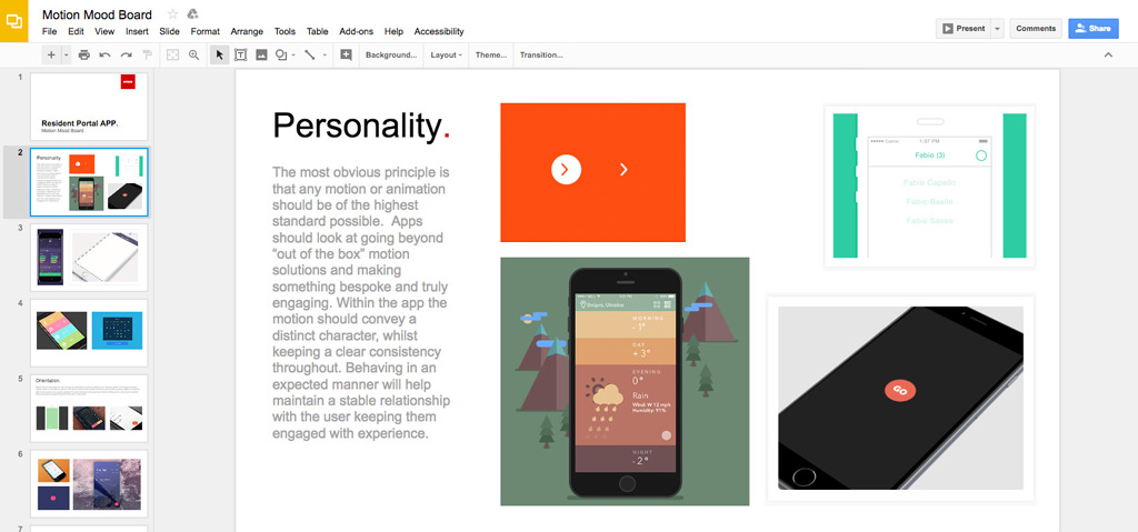
Motion Mood Boards Research
While user testing was ongoing my team compiled mood boards of motion graphics from various sources to provide inspiration for the movement of the app. This was the first project at Entrata that included motion design in the UX process.
Motion Design
While I cleaned up mockups post user testing, my team began motion design to bring the app to life. We met several times each week to look at concepts, discuss animations, and review output.
Production Mockups Design
The final step was a review of all the screens making sure everything was pixel perfect and ready for development to take over. With executive sign off the app was off to development.
Product Release 6 Months later
From the project kickoff in the summer of 2015, version 1.0 was released on the App Store on December 24, 2015. It included the ability to make a payment, submit a maintenance request, and several other key functionalities.
The Product
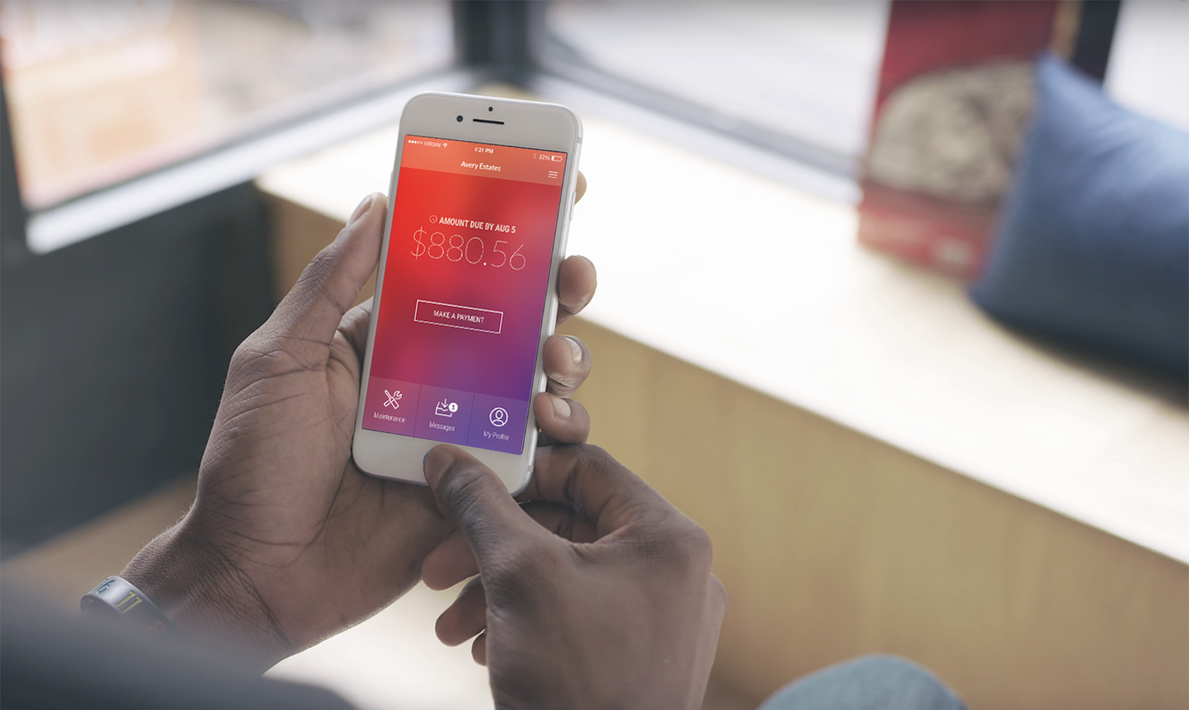
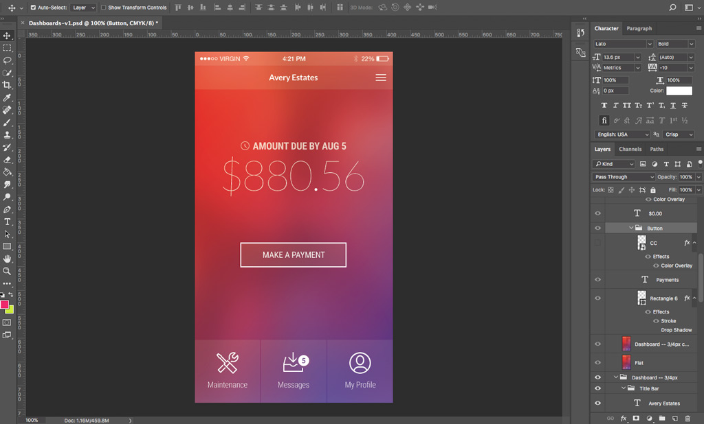
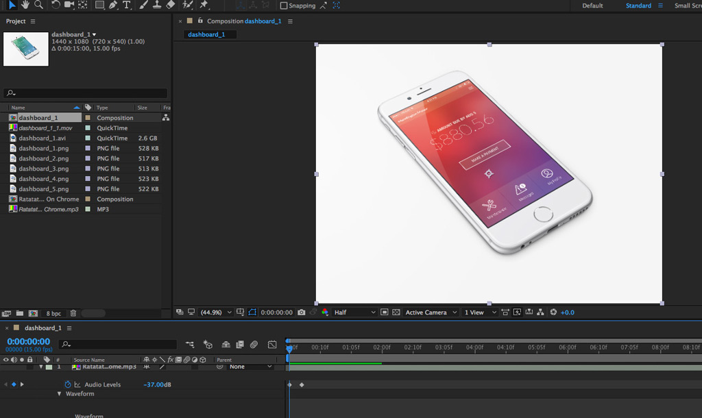
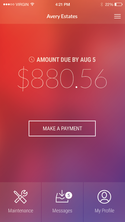
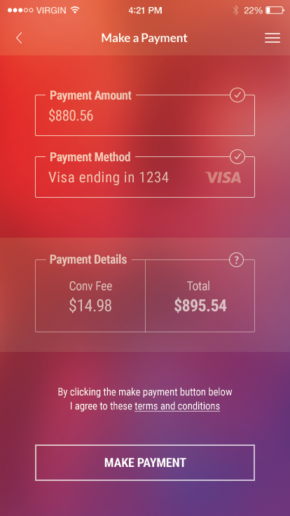
Payment Focused Dashboard
Payments are big business not only for properties and management companies, but also the providers who handle payment processing. From a business side this needed to be the focus of the app--driving residents to make payments. For the actual residents this was equally important. For most residents, interaction with the property revolved around payments and maintenance. Giving residents a quick snapshot of their rent, and allowing for quick payments was key.
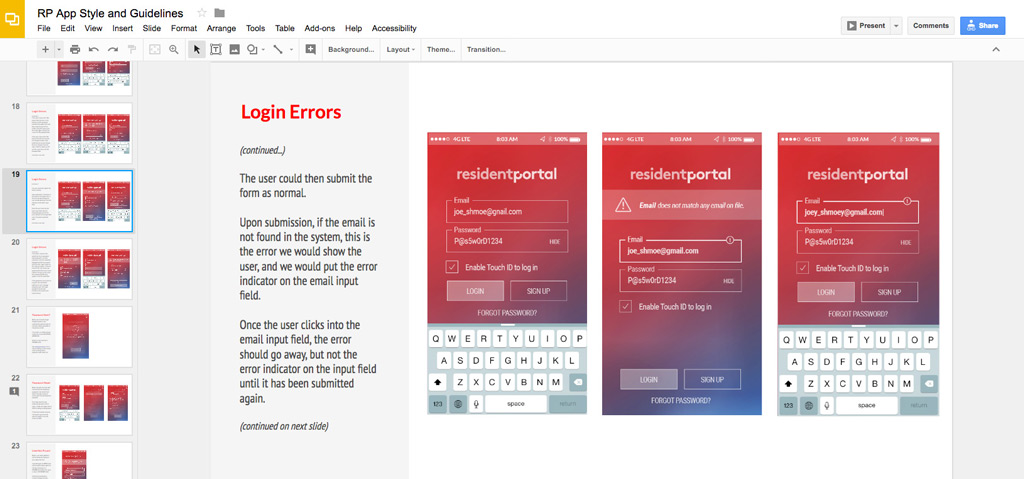
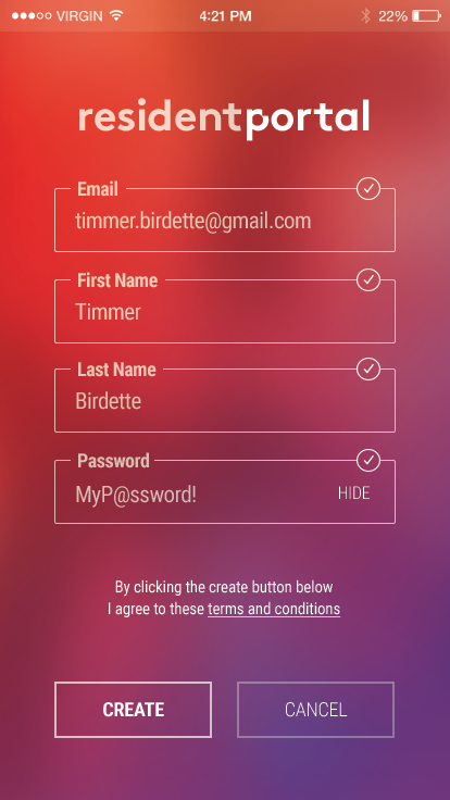
Simple Forms
Every process in the app needed to be simple. We wanted to make sure residents were able to do the things they needed quickly, and without burdensome interface and unnecessary inputs on forms. This meant reviewing each workflow we planned on implementing and figuring out what we could cut from the flows to get the necessary information in as few steps as possible. In most cases this meant 3-4 inputs on a screen, and no more than 2 pages to most workflows.
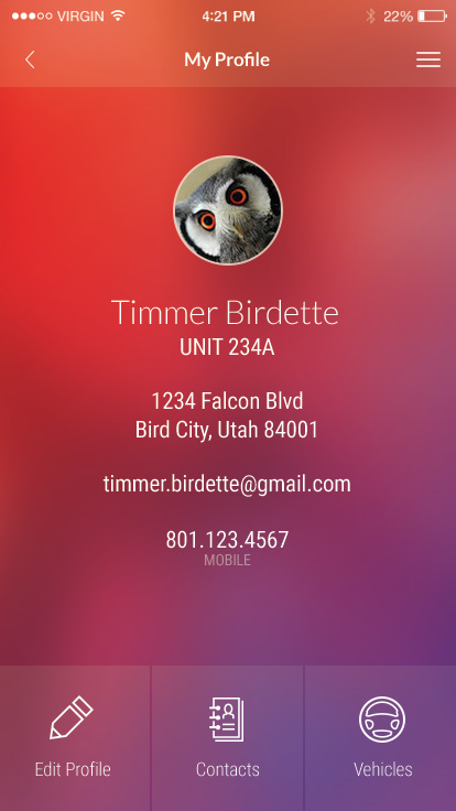
Minimalist Design
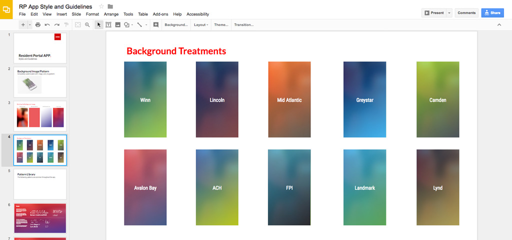
From the ground up the concept was simplicity--in every facet of the app. Starting with wireframing we decided to keep the interface minimal, with a focus on key information, obvious and focused navigation, and limited distractions. During the design phase we chose a gradient background that focused the resident on the middle of the screen, with white line icons, white easy-to-read fonts, and no unnecessary imagery, or clutter.
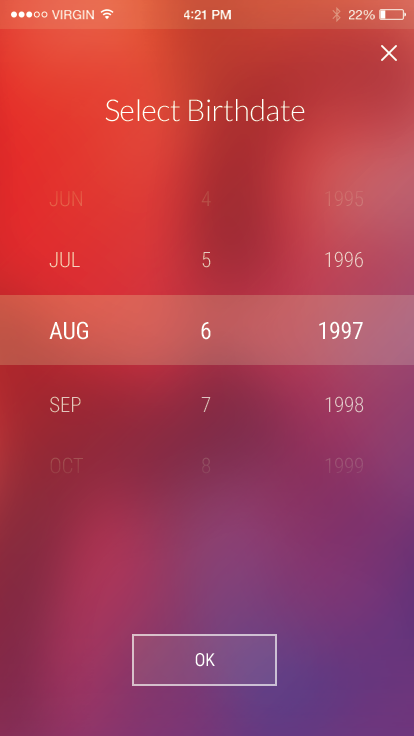
Styled Os Patterns
Sticking with the simple theme, we decided to reuse system standard patterns, styled to match the app. While it's popular to use built in Os components like a datepicker to maintain consistency across apps, in some interfaces they don't fit well with the flow. We opted to style these standard components and fit them into the interface for a seamless experience.
200,000 Monthly Users
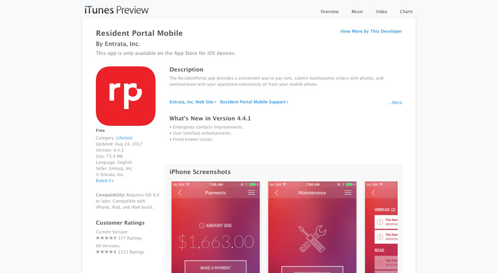
After 18 months on the market in both Android and iOs, ResidentPortal has more than 200,000 monthly users. The app has a 4.5/5 star ranking on the Play Store, with more than 2,600 reviews (1,700+ 5 star). In the App Store, the current version has 4.7/5 stars with more than 300 reviews--and a similar rating on more than 2,300 all time reviews.
Marketing Video from Motion Design
Used during product launch at Entrata Summit 2015, the marketing video introduced the world class app to the industry. The video was the culmination of hours of work that went in to the actual motion design of the product. While I did not create the video, my team developed the motion, and interactions that were used in the final product.